Updating look of doctors’ website
After several years of using her current WordPress-based website, Dr. Janet Hope Horwitz, Psy.D., wanted to change its look. There was no need to create or develop new content, so this simply was a matter of giving what was there a different feel and making some changes to how the content was organized.
The old look was dominated by two saturated colors: burnt orange and mid-green (see image below). Burnt orange was used for the background of the top phone number, the current page menu tab, and the drop-down menus (not pictured). The mid-green (between sea foam and new leaf green) was used for the background of the sidebar.

After speaking with Dr. Horwitz and finding out more about what she was looking to do, I came up with a plan for updating her look by (1) softening the bold colors that were drawing the eye away from the content and (2) making her site responsive to device sizes.
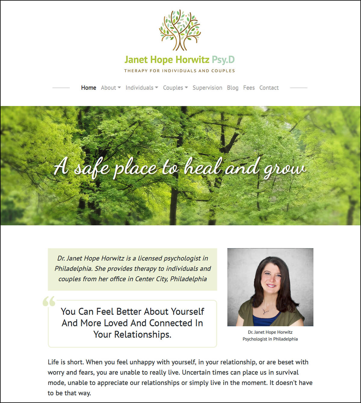
Her logo already used a mid-green color, which would not change, so I used softened tones of green, sky blue, pale teal, and pastel yellow to create a background image across the top of the website. This immediately set a beautiful tone that I then played off of for the rest of the page elements.
The orange current-page menu backgrounds were removed from the top menu instead of a green link color and the butterfly from her logo. I also worked with Dr. Horwitz to reorder the menu content to create “silos” of related information which is much better for SEO (search engine optimization).
The old theme was a non-responsive Genesis theme, which I changed to a responsive one based on Bootstrap 3. Because the site was now responsive, I moved the sidebar to the right so it would be below the main page content on smaller screens. As the content is now grouped properly on the menu, I created separate sidebars for each silo group so only pages from that specific group would show on its sidebar. I also created a different color scheme for each sidebar group to give a sense of interest throughout the website and page group continuity.
To complete the transformation, I added a full-width Google Map above the footer with a “get directions” function. This helps with local SEO and makes it easier for clients to find her.
The end result is a website whose more subtle look conveys more of Dr. Horwitz’s personal style. Her website content is now the main focus.