Princeton Public Speaking
This is a redesign of Matt Eventoff’s original public speaking WordPress sites, which I combined into one site. The individual articles of the old sites were well done and needed no work. However, the structure of the categories and pages needed some work. It also required a new look that was modern, clean, responsive to device sizes, and presented him as the professional he is. I chose to make the look based on the black and white greyscale but with a pop of color from his logo (see below).
The Content and URLs
As with all redesign projects, I started with the content because, to be honest, all a website really is is a way to present content so people can find what they are looking for. The post and page URLs on the old sites were not explicit enough, so I renamed the categories and “siloed” the content to help the search bots understand the content relationships better. Once I had the content better organized, the site started coming together.
301 Redirects
The big problem with changing URLs on a site that is already live is the possibility of ruining any search engine rankings a page or post has already received. The site was already getting good traffic, so it was important this did not change. Once the site was live, the final task was to do 301 redirects for all the URLs that had changed. This was a painstaking process of finding all the URLs already indexed and redirecting them to the new URLs.
Image Style
To help define the different pages and post categories, I created unique top images for each. I kept with the greyscale by turning all these top images into black-and-white photos and graphics. However, as the site is all about his public speaking training, I kept him in color. The effect of this is that the backgrounds fade to be less important, and your eye is naturally drawn to him.
Unique Current News Page
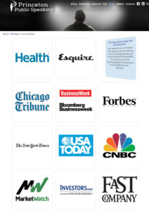
The posts in the current news category needed to be presented as logos and blocks of information that would flip over when hovered with the mouse. This was a unique challenge that I enjoyed creating. Not only was I able to get these image/content areas to flip, but they are also on a random timer, so they flip on their own.
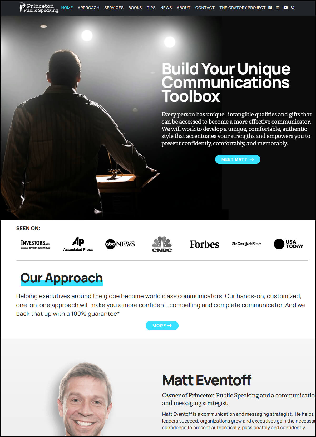
The Homepage
As I always tell my clients, the homepage is just a way to help visitors understand your site and then direct them to what they are looking for. This is why, in most cases, the homepage is the last thing I create.
The homepage for PrincetonPublicSpeaking.com is in the style of a long one-page site with several sections; each focused on a different area or idea. The top section is a large static hero image using the same black-and-white style with Matt in color. As blues are seen as professional and trustworthy, I used a dark navy for the main headlines, a rich sky blue for the link color, and a few headlines that needed to stand out.
The top most section, the “Hero”, is agreeably the most important image on any website. A visitor makes a determination within 8 seconds to stay or leave a website. What they first see, also known as what is “above the fold”, is critical to keeping a visitor on your site. The image I created keeps with the grey-scale look and shows an audience applauding and looking at an image of Matt, who is in color. Anyone who is looking for help with public speaking will immediately see this as the positive result they wish to achieve. Immediately below are logos of recognized media companies that have featured Matt. This is quickly understood as Matt having great credentials. All this gives the visitor the best information they need to decide to say and find out more.
The homepage sections alternate between white background content sections and parallax image sections. Parallax is an effect that moves the background image at a different speed than the content that moves over it. I used these sections to describe the different pages and post categories making it easy for any user to find the information they need.
Redesigning the Logo
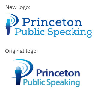
And last, but not least, I also took on a redesign of his logo. The original business logo had a good idea of making sound waves and a microphone look like the letter “P”. Yet, it was looking a little outdated so I kept the idea and the colors and improved the style by making the microphone into a person and changing the font to a more solid yet approachable slab font.
This project was challenging and quite a rewarding design endeavor. The final result is a website that makes a statement without “shouting”, shows Matt to be the professional he is, and presents the content in a way that is accessible to the user.