Patricia McCarthy Law
Patricia McCarty, esq., works as lawyer in the Washington, D.C. and Baltimore, MD areas. She wanted a website that represented the excellent work she has done while not looking like “just another law firm” website. Here my challenge was to bring in feminine elements while exemplifying a strong professional feel.
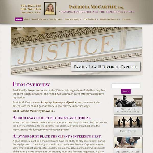
To start I sent a good deal of time looking at other law firm websites to see what her competition was doing. Though this was time well spent it did not bring me any closer to an idea for a look that satisfied my criteria. So I went to my favorite graphics website and just started searching for lawyer-type photos and background. Here I found a “metal-look” background image that had shading and colors that appealed to me. Though I never used this image in the designing of Ms. McCarthy’s website, it was the basis for the creation of the overall look. I really liked the “brushed bronze” coloring with the warm beige background but it was lacking the feminine. This was solved with the addition of a rich plum-purple color for the main titles, buttons and menu highlights. And instead of using a black/grey text font color I choose a dark brown which gave the whole site a cohesiveness.
As Ms. McCarthy has experience in many areas of law, it was important that the site give focus to each one with it’s own page. And pages and pages of only text does not make for an interesting website. Therefore, I took a great deal of time to find image headers for each sub-page. It was important to find images that represented the area of law without being sensational or depressing. This was especially important for the areas such as “assault and battery” and “child custody & support”.


I also tinted all images to coordinate with the brushed bronze and beige tones which gives the whole site a soothing feeling.
To help with navigation and theming the site, I used thumbnail images created from the header images as a visual trigger to help visitors locate what they are looking for. Each one features a engraved stone title piece to give the impression of stone and granite courthouses.
To enhance navigation, I added a function to the top menu so it sticks to the top of the website when the page is scrolled, making it easier to navigate the site. The a full sitemap menu on the bottom shows all the contents in a glance. All these elements work with the responsive website functions on different device sizes.
The usability of the site is further enhanced with an interactive, full-width, Google Map at the bottom of each page which shows the locations of her offices.
The end result is a professional legal website that stands out from her competitors and represents who Ms. McCarthy is as a person.