Heaven Sent Memorials
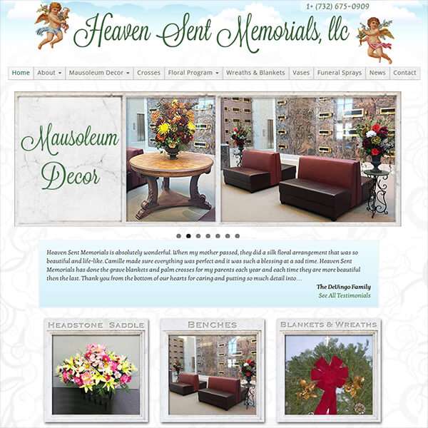
Camille Cordi contacted me to create a website for her unique business of cemetery flowers. She creates customized seasonal arrangements for individual cemeteries which they can then sell to their clients. The website was to showcase her creations and work as a catalog for expanding her business.
The challenge with this project was to find a look for the website that was sincere and respectful (without being dreary) while also being friendly and approachable. The business cards she had used for years had cherubs as the main design component and she wanted to keep them for continuity. So I first found cherubs that were similar to what she was using but not copyright protected – a harder task then you might imagine! Eventually I found a set of good cherub images that were human-looking and not cartoons. Then by adding soft stylized clouds to the background, the main look of the site was established.
Next, I focused on the font for the business name. Finding the right font for the name was critical as it had to have the correct “feel” and would dictate the rest of the design elements. After trying over 60 fonts I settled on Lavanderia Regular. The handwritten style with large capital letters and graceful swirls set just the right tone. Then I used it in a deep forest green to represent the floral elements of Camille’s work. I choose not to embellish the letters with any depth, contours, or other styling as to not distract from the beauty of the lettering themselves. I also turned this into a webfont so it could be use with the web page titles.
The another dominant design element are a grey-beige stone look used for the background of the top menu, surrounding the home page slider and used to create frames for featured page images. This was done to invoke the idea of a cemetery without literally having to show headstones.
 Once all that was established I became concerned with the solid white background of the site. When I tried to add tints of color, the effect was to dull down the site. As I was trying to solve this issue, Camille hired a designer to create a flyer/mailer and her business cards. I supplied the designer with my header font, cherubs and clouds so everything would coordinate. When I saw what the designer used as a background for the flyers, I knew that was the solutions I was looking for. So, after some work I was able t0 manipulate the swirl design into a repeatable tile then softened the colors to be just noticeable as a website background.
To make the website a catalog of her work, a gallery plugin was used to create masonry tiled galleries that, when clicked, opens up the images into a full-screen viewing area.
And finally, a testimonial plugin was installed and colored to match the top title clouds. And with that, the look of the site was complete.