First Baptist Church of Manasquan

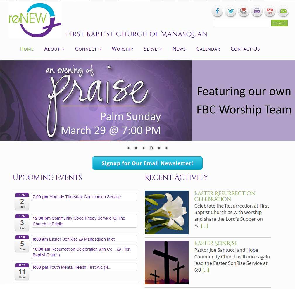
The First Baptist Church of Manasquan New Jersey chose me to design their new website and it has been my pleasure to deliver to them a website that met their needs. As a non-traditional church, it was important to them that the website was open and bright to reflect their congregational nature.
When going over their original website and talking about what worked and didn’t work, I noticed a logo on the bottom of a page that caught my eye. The custom logo, reNEW, was created for them by Katie Lane Kenney of Jam Concepts. The crisp colors and style evoked the feeling they wanted in their new site. Together we decided to base the new website on their reNEW logo.
Strategic Use of Color
The logo colors of leaf green, turquoise and purple are vivid so using them strategically was necessary so as to not overwhelm the information being presented. White social media buttons were created that used small colored icons to bring some additional color to the header without drawing needless attention to them (which would have happened if they where solid blocks of color).
Between it being a white website and the client wanting a light open feel, this presented the challenge of how to designate areas without being too heavy handed about it. The home page top image slider created a natural dividing line between the top menu and the content body. However, the interior pages had no such demarcation so the pages looked incomplete. I was able to create a simple design element that serves to separate the header from the body that also brought the idea of new life and renewal to the pages. The hand-drawn green line has a little loop on the right with a gentle trailing tail at the end. This evokes the idea of a vine and a little new leaf that adds so much to the style of the page, even though it is a small-in-size image.
![]() Completing the style of this website is the choice of the Cinzel Decorative font for the church name and the headings. Being a serif font it has a traditional look, but the added wisps of flare on strategic letters gives it a modern and friendly look. I especially like how the Google font version loops double O’s together:
Completing the style of this website is the choice of the Cinzel Decorative font for the church name and the headings. Being a serif font it has a traditional look, but the added wisps of flare on strategic letters gives it a modern and friendly look. I especially like how the Google font version loops double O’s together:
 In the end, by using only two design elements (logo and vine divider), one stylish font, and strategic use of font colors, the site is light weight and evokes the image the client desired.
This WordPress website theme is based on Bootstrap3 and is responsive to device sizes from cell phones to large desktop monitors.
One thought on “First Baptist Church of Manasquan”
Comments are closed.

We couldn’t be happier then we are with our new site – Trishah listened carefully to what we were hoping to achieve, added great technical insight and artistic flair, and created a site that is attractive and easy to navigate. Throughout the process we worked as a team – to get what we wanted – but in a way that was easy to design AND maintain.