The Oratory Project Redesign

Categories
Category: WordPress Websites
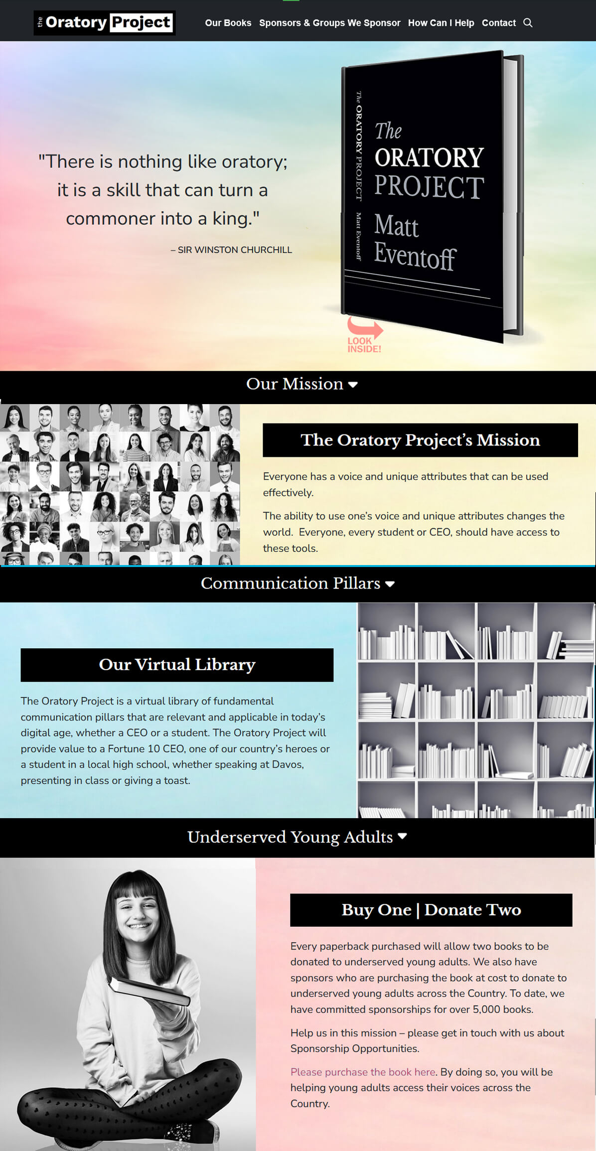
The Oratory Project’s website has changed several themes over the time I’ve worked with them. When redesigning it, I kept in mind that the owner likes black-based websites and his desire to appeal to young adults, adults, and CEO’s. I researched colors that would be calming and reassuring while also evoking energy and focus. I settled on a multi-colored abstract background that used the colors my research said would fit the bill.
This website features a home page with “window shade” sections that overlap each other as you scroll. The book image in the home page hero section is clickable and brings up a lightbox with a PDF preview flipbook of the book’s first part.
