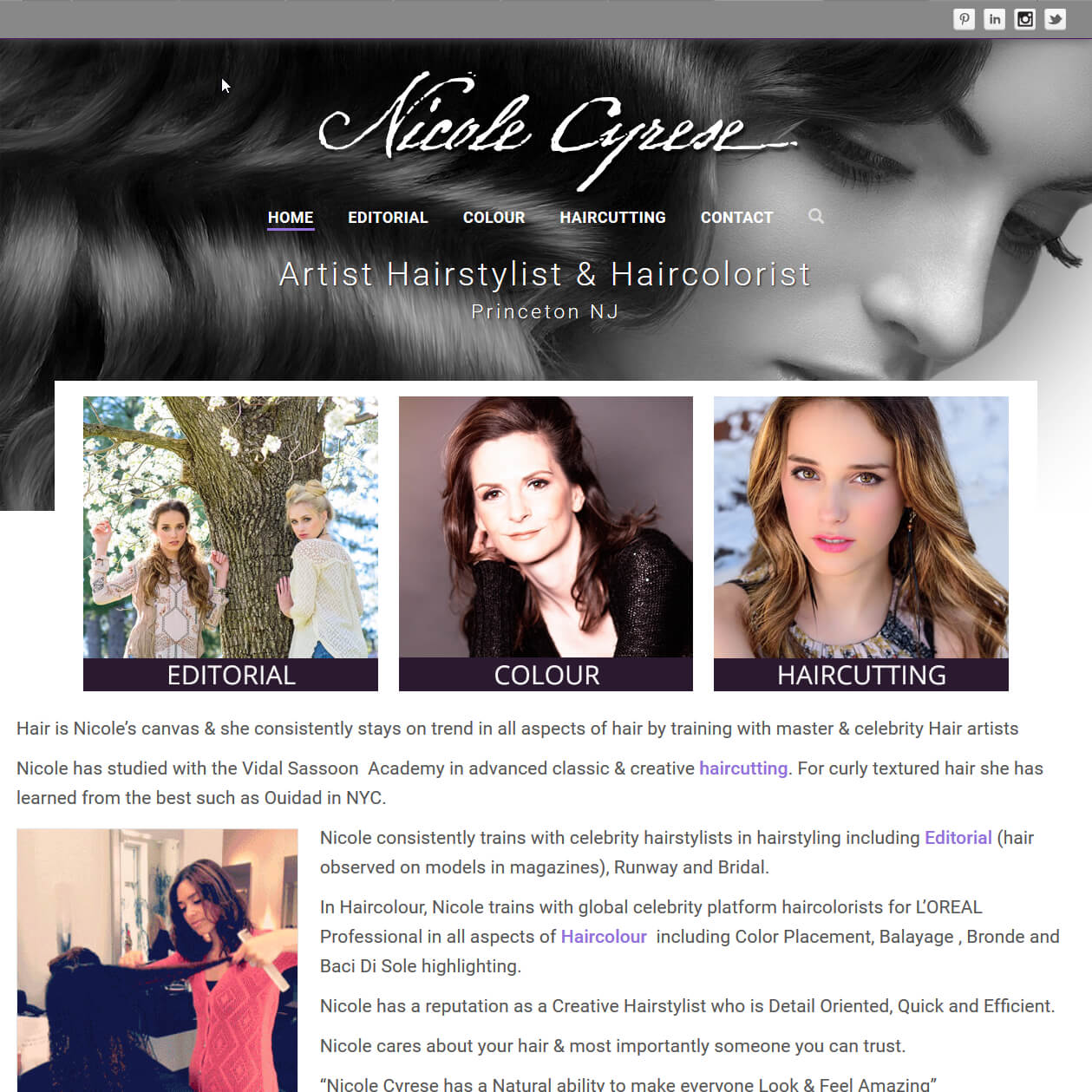
Nicole Cyrese – Artist Hairstylist & Haircolorist

Nicole came to me wanting to redo her existing website to more closely reflect her personal style. Some things she wanted to keep was the overall grey-scale with a pop of her signature violet color, alone with the background scroll pattern of the header, Instagram feed and image galleries.
As the header of her old site took up a lot of room at the top of every page, that was the first thing I changed. I choose to do a unique homepage header and incorporate the scroll design into the top of the interior pages.

The homepage uses a large grey-scale hero image of beautiful hair with three thumbnails over top, each representing one of her three categories of work. This gives the homepage a dramatic feel and puts images of work front-and-center (literally!).
To give some depth to the interior pages, I kept the scroll pattern but turned it into a transparency with drop-shadows over a textured background in order to make her name logo stand out.

By also making the header less tall it allows more of the lower content to be seen without scrolling.
You may also have noticed that I gave her name logo a new font which makes it easier to read while retaining the natural hand-written feel.
Instead of her original boxy galleries of that needed to to be paged through, I incorporated a modern responsive Masonite gallery that changes shape based on browser/device size. This works well to show all her images in their best light as many of them are not the same shape.
The sidebars of each page show random thumbnails from the galleries on the other pages along with a contact form.
The end result is a modern website that is fully responsive to device sizes and now focuses on her work rather than a header image.
