The F.A.R.M. Team Organization

The FARM Team is a non-profit organization whose mission is to help young people re-enter the workforce while in addiction recovery. They needed a web presence that would reflect their mission and be a point of contact for both potential clients and for donors.
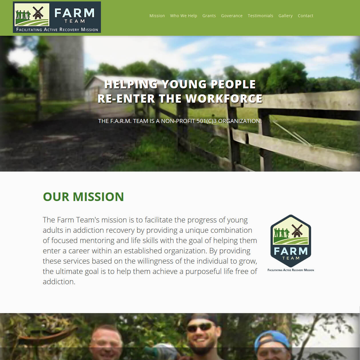
They did not need to have a lot of information on the website so I chose to make it a one-page site. This means the home page is one long page made up of sections. This format works really well when there is limited information, or when there are key points that need to be made.
The image sections are parallax, meaning the background images move at a different speed than the content that is scrolled over top. These images are of the farm where the clients work.
Some of the noteworthy features of this design are:
- A shrinking top menu that decreases in size when you start scrolling down the page. This reduces its footprint on the viewable area of the screen while still remaining functional.
- Main top menu items link to home page sections, not to individual pages.
- Dynamic top menu item highlighting when clicking menu links or scrolling up/down page through the sections.
- Smooth-scroll to anchor points from both main and footer menus.
- An integrated donation API from CrowdRiser that allows donations without leaving the website.
- A testimonial rotator that shows excerpts of clients experiences. The full testimonials can also be views on separate pages.
- A mosaic gallery of images from around the farm. These can open up into a shadow-box style overlay where the images can be viewed in a larger format.
- And an integrated contact form.
- And the site is responsive for large monitors as well as smaller devices like tablets and phones.
The color scheme was taken from their logo that they provided. As their actual logo is an elongated octagon it was not appropriate for the header area. That shape, when shrunk during page scrolling, would be so small it would be barely recognizable. So I reformatted the design elements into a wider-than-long rectangle. This gives the same design the ability to be large or small and still be seen.
The clients are happy with the final product and the website should be a good web presence for their wonderful organization for quite a while.
