Cake It Up Cake Stands

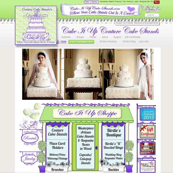
CakeItUpCakeStands.com is one of those special websites that sells a unique niche product and needed extra consideration because of the complexity of the custom product being sold. There are many aspects of this highly customized website I could tell you about, from the custom image galleries that give instructions on what options to choose to replicate the pictured cake stand, to the “Birdie’s Chirps” (little thoughts the owner wants to share) homepage rotator that displays the text in the shape of a heart, to the Shoppe page main image that links to all the shopping cart categories. But what I will focus on is the dynamic custom WordPress plugin we created for the custom cake stand ordering page.
The Creation of a Dynamic Custom Product Shopping Cart Page
A lot of careful thought had to be put into finding the right shopping cart. The custom product has thirteen variables (i.e., fabric, ribbon, monogram, etc.) that together have over 500 individual options and each option needed an image. Imagine a product page with 500 pictures on it… the page would be a yard long, and I don’t think I am exaggerating with that estimate! As a page that long would be too daunting for any customer to deal with we needed a way to dynamically limit choices to just the ones the customer actually needed.
Once I choose the shopping cart with the best product option image solution, then the task was making those long pages more manageable. The final solution was actually accomplished in three stages…
Stage One: Dynamic Variable Choices

First, we created a decision tree that laid out the most efficient process based upon the options that went together, and in what order to present them so the whole process would be efficient. For instance, if you wanted a cake stand covered with satin fabric wrapped in a rosebud trimmed ribbon, then the other 10 variables for regular ribbons, monograms, etc., do not need to be displayed. So far so good… now for the technical part…
With the help of a talented coder, we worked to create a dynamic page that opened and closed the variable sections based on the previous choices. If this choice is clicked then open these variables and close those variables… repeat until there are no more possible choices. Then go back and make a different initial choice and follow that one through until no other choices are possible. Repeat this process again and again, until we finally had a dynamic product page that work perfectly.
Once this part was done and I stepped back and viewed the dynamic page with fresh eyes, I saw there was another problem that needed to be addressed… We were showing the customer the pictures of each option as they chose it, but what would all their choices look like together? What we needed was a “virtual mockup” that would dynamically change as they selected and deselected options. So back to work we went…
Stage Two: The Virtual Mockup Tool
The Virtual Mockup Tool is a floating popup window that is fixed to the left side of the screen so it is always visible on the page and is integrated into the eight custom cake stand pages. As the customer clicks on a product variable option, an image of that choice is added to a layered image area. For instance, first, the fabric covers the area, then the ribbon choice is layered on top of the fabric, then the brooch on top of that.
Below the mockup image is an outline list of choices the customer has already made, like: “Fabric: Satin Dusty Rose”, “Ribbon: White – 029”, etc. Now the customer can see an image of how the choices will look together, plus have a shortlist of the specific choices altogether in a floating box that is always in view. All that was left was the beta testing.
After just a few beta testers we knew there was another problem that needed to be addressed…
Stage Three: Dynamic Instructions

People were picking a fabric choice and then had no idea what to do next. They needed more specific instructions. So the last part of this Visual Mockup Tool plugin was to add instructions. “Choose a fabric”, “Now choose your trim”, and so on… all with a little hand that points in the direction of where you are to go. Once this was added the custom cake stand pages were now manageable.
Completing the plugin is a “Close Mockup” button the removes it from the screen but leaves and an “Open Mockup” button to get it back. This was important for customers accessing the page from tablets and cell phones. Additionally, we added a “Clear & Start Over” button and the total cost of the item as you are assembling it.
It was a lot of work and an end result is a tool that customers find helpful and that the owner can use to help her clients put together “the cake stand of their dreams!”
[single-testimonial id=”371″]
