99 Percent Out Loud

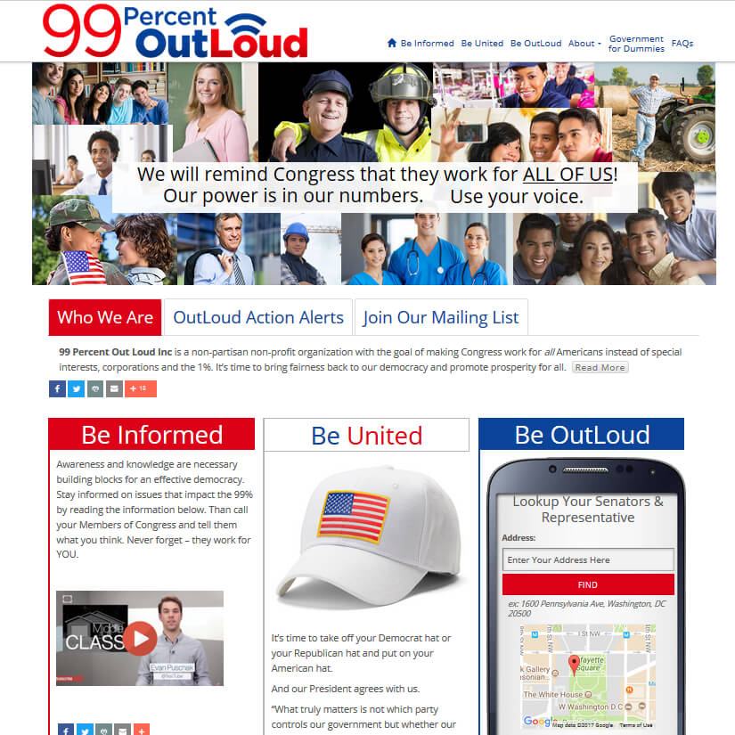
This client and I became connected as she was researching how to give her website visitors a way to contact their Congresspeople and contacted me because of my development work with the WordPress plugin CongressLookup. She came prepared with a basic structure for the website and an idea for organizing the home page. The goal was to create a clean site, using patriotic colors but not “flag-y”. The end result fits all these requirements.
The home page hero slider is a one-slide presentation of the basic political concept of the organization and the purpose of the website. This is set with a cookie to only show one time per day to allow visitors to not be distracted when exploring the website.
The next section down takes advantage of Bootstrap 3 native tabs and a “read more” button. This allows a good deal of information to be available to the visitor without it taking up much real estate. The content of these 3 tabs can easily be changed and updated from the WordPress Admin.
This also holds true for the 3 red, white, and blue columns below. Each has its own page in the WP Admin so the content is easily updated. These sections were part of the client’s original concept. They posed a bit of a challenge as I knew that when viewed on a phone these columns would collapse and stack one on top of the other. As this will make for a very long page, I was concerned that visitors would get confused about which section they were in. This is why each column has a different color with a matching colored left border. As I was working on it I realized that I could make them look like “flags on poles”. This worked to follow the patriotic look and be functional reference points when navigation the long page.
The other noteworthy item is the “Out Loud” column which features my CongressLookup plugin. This section gives visitors all the information they need to get informed and find their Congresspersons contact information.
