SleeveOn

SleeveOn™ is a small group of innovators and builders who develop simple solutions for consumers and businesses that make their daily life easier and profitable.
They needed a business-to-business website to showcase their premiere customer loyalty program. It was important that their environmental commitment be featured and it included a brief overview of the barcode system. The goal is to encourage businesses to contact them for more information.
As the website did not need to have any extensive explanations of the system, I chose to make it a one-page HTML-based website. This gave me the option of showcasing the various points that needed to be made in separate sections.
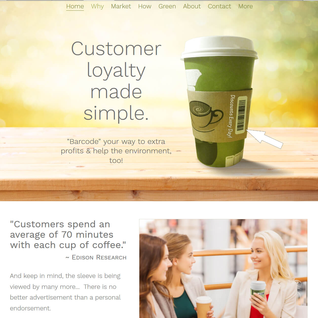
For me, the fun part was finding and developing images that provided a visual explanation without the need for a lot of text. The top hero image has a bright yellow and green mottled texture with what appears to be a light source in the middle and a wooden table in the foreground. This is bright and cheery and immediately says “healthy”.
On top of the hero image is a pausable image rotator/slider that shows the system barcodes on coffee sleeves as well as a shopping bag. And the large title simply saying “Customer loyalty made simple” gives the visitor the information they need to understand the product being offered, a context for what they are viewing, and encourages them to delve deeper into the page for more information.
The sticky top menu stays at the top of the window for easy navigation and will smooth-scroll the user to the different page sections.
As there were few images available with coffee sleeves in the correct position to illustrate what was needed, I created them. For instance, this image of women taking in a mall had them holding coffee. I added the SleeveOn™ coffee sleeve to the woman who is the focus of attention along with text that says, “Customers spend an average of 70 minutes with each cup of coffee… And keep in mind, the sleeve is being viewed by many more… There is no better advertisement than a personal endorsement.” Together, the statistic, the text, and the image explain how powerful this type of advertising and customer loyalty system can be to a business.
As their environmental commitment is so important to them, the one-page section format allowed me to give it a section of its own. There’s nothing better than a beautiful image to tell a story.
All the sections with image backgrounds are parallax, meaning the text scrolls over the top of the image at a different speed than the background. This is a lovely way to give the page movement that is dependent on the visitors’ behavior. It gives a sense of engagement and control.
The final result is a beautiful yet simple responsive website that showcases its unique customer loyalty system.

